
Hello, this is Lake and Moon Design.
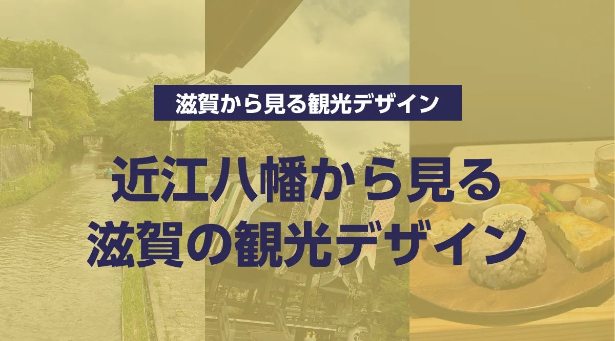
Omihachiman is one of Shiga’s most iconic landscapes. Of course, the famous sights left a lasting impression. But what stayed with us even more was the beauty of how the entire town “blends together”—a sense of comfort that washed over us as we walked through the streets.
In this post, rather than simply touring the sights, I’ll interpret the “aesthetic of mutual recognition and coexistence” that flows through this town as four design principles from a designer’s perspective. In fact, these principles are the very same values we cherish when designing our own website.
Sincerity Toward Materials: “Believe, Don’t Just Decorate”
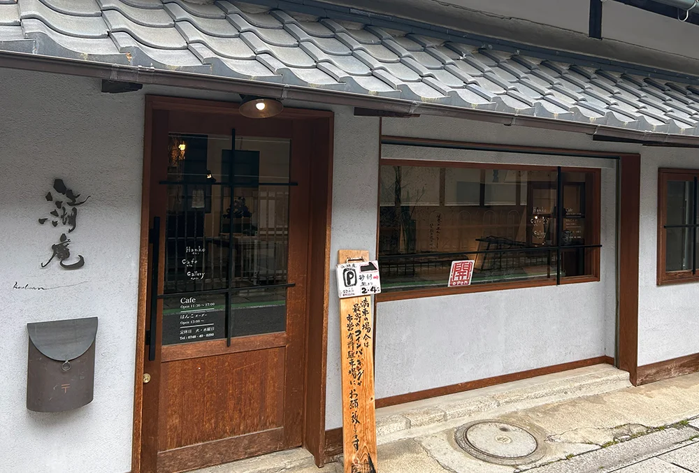
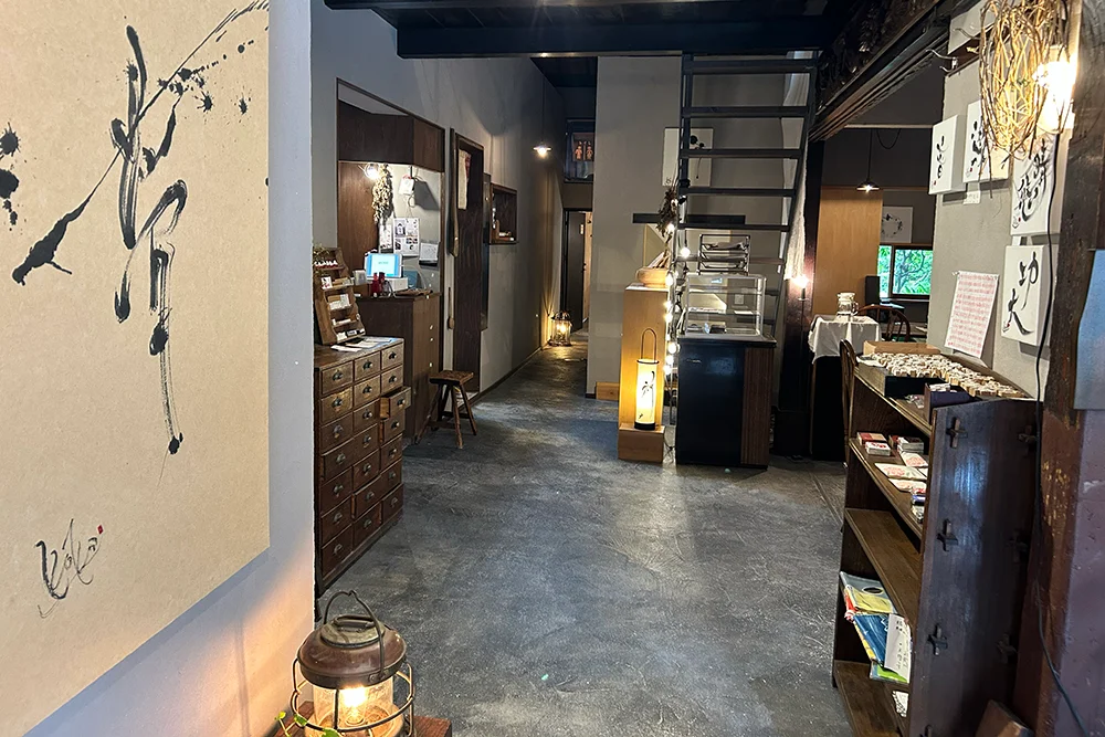
My time in Ōmihachiman began at Kōkoan, where I stopped for lunch. It’s a somewhat unusual dining spot housed in a traditional Japanese house that also serves as a seal-carver’s workshop.
“An artisan’s workshop” and “a dining spot.” Looking back, this space—where two different livelihoods coexist seamlessly within a single old building—may have been the first glimpse of the theme of “coexistence” that we would later experience throughout the entire town.
The dishes we were served were unpretentious, yet had a very natural feel—as if they firmly believed in the inherent power of the ingredients themselves. Rather than surprising us with flashy presentation, they gently offered the pure goodness of what was born from the earth, just as it is.
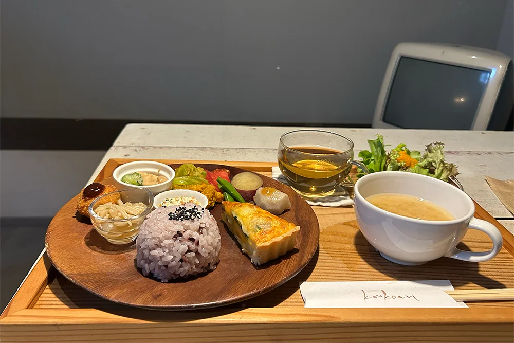
The same applies to website design. Rather than layering on decorations and flashy effects, a design that trusts in a company’s inherent strengths—its products, services, and the words of the people who work there—and conveys them directly ultimately resonates more deeply.
An experience cannot be created through a one-way street: “The relationship between the viewer and the viewed”
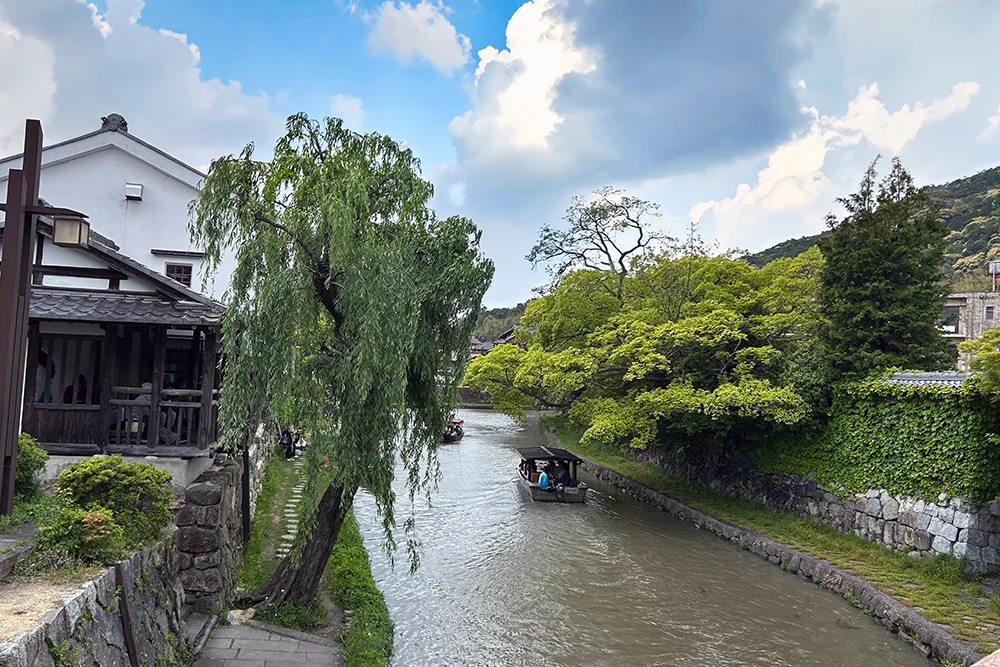
We make our way to “Hachimanbori,” a symbol of the city. It is an artificial waterway once built to protect the castle and transport people and goods throughout the town.
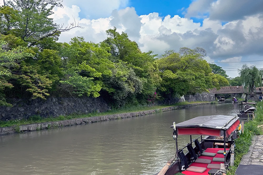
A boat glides slowly along this canal. The back of the person rowing and the passengers swaying gently on board.That scene was more than just a “beautiful view” for those simply watching; it was a “tourist experience” in itself, savored by both those aboard the boat and those observing it. Passengers enjoy the view from the water’s surface, while pedestrians find a sense of atmosphere in the scenery featuring the boat. They complement one another, creating a single, enriching moment.
Websites, in fact, are built on the same principle. If the operators simply list “what they want to show” unilaterally, it doesn’t result in a meaningful experience. Only when the design takes into account how visitors feel and how they interact does it become a truly enjoyable experience.
Novelty does not negate tradition; it coexists with it
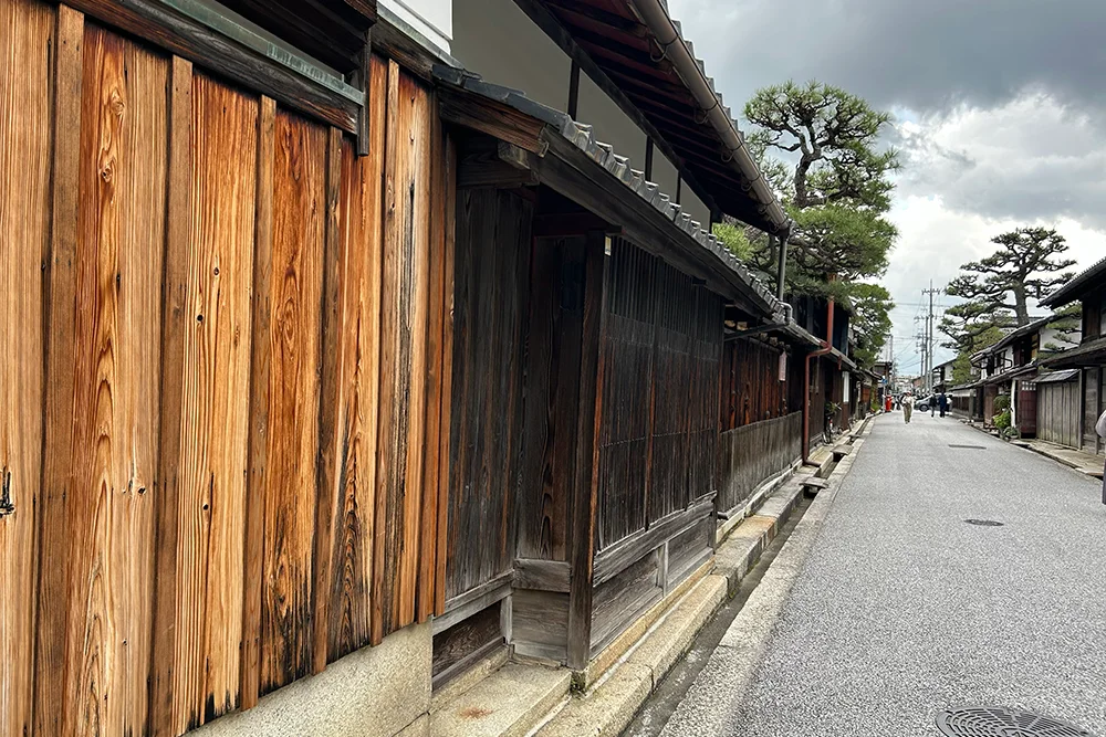
As the rain begins to fall, I walk down Shinmachi Street, enveloped by the texture of the damp stone walls and roof tiles. Take, for example, the doctor’s office housed in a traditional Japanese home. The sign, featuring “clear acrylic panels and dark lettering” set within a wooden frame, blended seamlessly into the scenery while allowing the building’s texture to shine through.
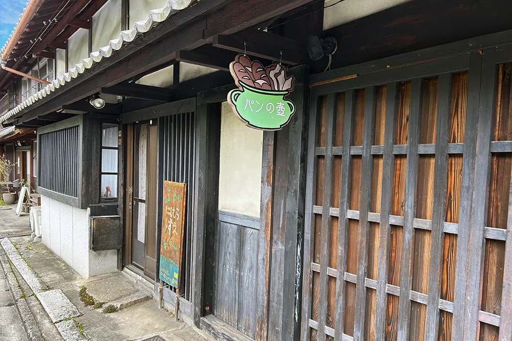
The same is true of the shops and restaurants lining the street. Rather than forcefully asserting “convenience” or “newness,” they respect the context of the town and simply exist within it. The new does not negate the old history but is added to it with respect.
This is an important perspective to keep in mind when redesigning a website as well. Aligning with the latest trends is entirely different from erasing the unique identity a company has built up over time.We place great importance on “complementing” a company’s unique character with a new form. As these small overlaps quietly accumulate, they create an unshakable sense of comfort throughout the entire town. This may be a form of aesthetic sensibility unique to Shiga—one that resonates with the sense of harmony we prioritize in our website design.
Small choices foster a sense of attachment
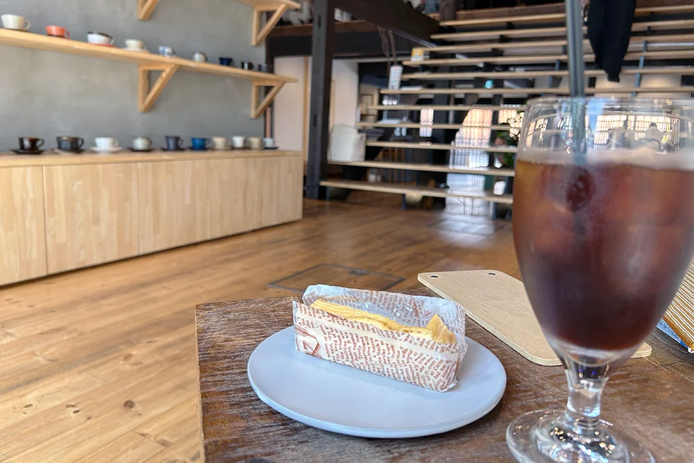
At the end of our stroll, we headed to Jinnosuke Coffee.
We were warmly welcomed and treated to iced coffee and rich cheesecake.
Glancing at the shelf, I noticed a row of stylish mugs. I was told that if you order hot coffee, you can choose your favorite one from the selection, and they’ll brew it for you. Being able to choose “one just for me”—that small joy seems to speak volumes about the warmth of this shop.
Similarly, a website is more memorable when it leaves a little breathing room—allowing visitors to find “what suits them”—rather than being rigidly structured down to the last detail with the creator’s intentions.
Summary
As I sipped my coffee and reflected on my visit, what left the strongest impression—more than the buildings or landmarks themselves—was, above all, the “spirit of the town.” It’s not about making things stand out, nor is it simply about arranging them in neat rows; it’s the power of everything acknowledging and interacting with one another to create the landscape.
Sincerity toward materials, interactive experiences, approachable innovation, and the freedom to choose. These four lessons we learned from Ōmihachiman are precisely the principles we cherish when creating our own website. Perhaps there is still much more of this “beautiful coexistence” hidden throughout Shiga.
 Contact Form


 Related Articles
![5 Top Website Design Companies in Shiga [2026 Updated Edition]—Honestly, I’m almost jealous of how good they are](https://images.microcms-assets.io/assets/5c8b5d0f3c3045c4bf65bf33c482859f/e4d05b2456b74f949c290edb432b5968/5gdp.webp)