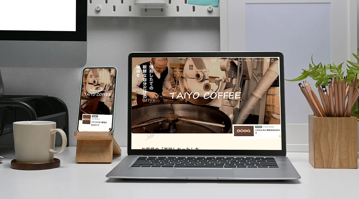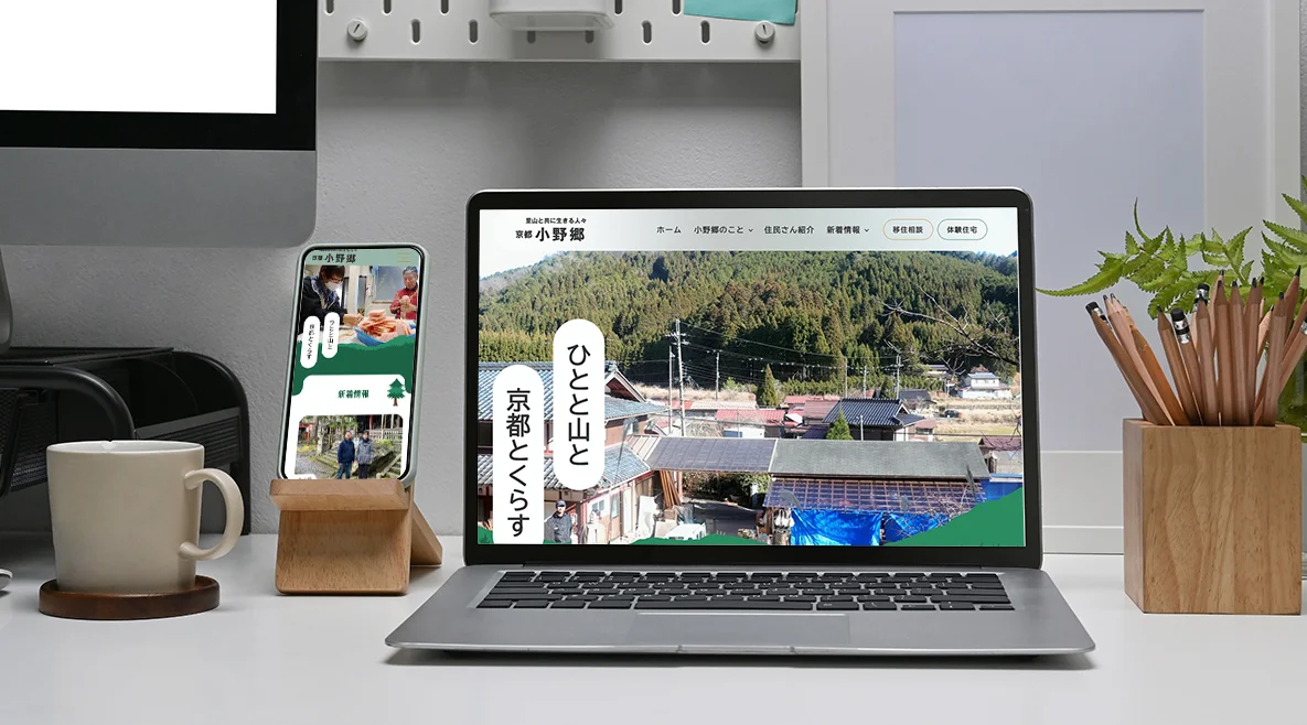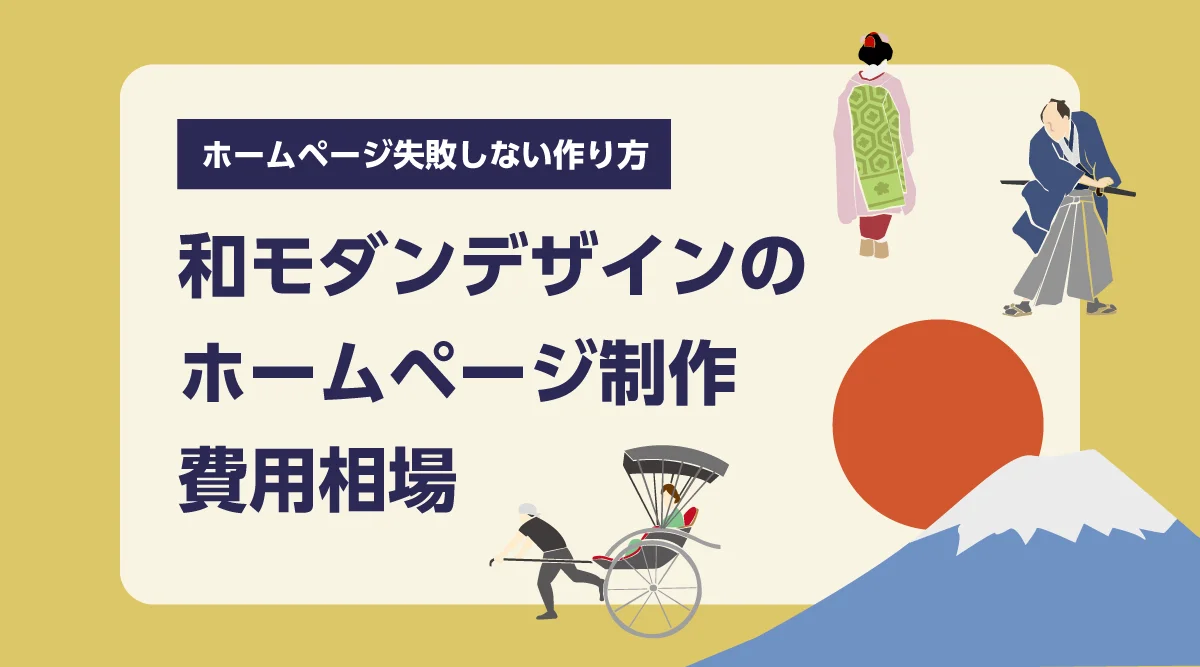

Hello, this isKototsuki Design.
Light softly enters through the shoji screens, the feel of wood, and the ink smudges. Because of the empty space, each item slowly enters the eyes. Japanese spaces possess such a "quietness."
I want the websites of shops, inns, and workshops to have that kind of tranquility. It seems that more and more businesses are thinking this way. However, even when we say 'Japanese modern,' what everyone envisions is different. How much does it cost? Will using Japanese patterns or brush lettering make it Japanese-modern? Will stylish designs also help attract customers?
In this article, we have organized the design concepts, cost estimates, and key points to avoid mistakes, incorporating data into Japanese-modern website creation.
Key points of this article
- Wa Modernity is not about "adding Japanese elements," but about creating "tranquility" through the texture of materials, simple beauty, reinterpretation, and harmony
- In 2025, there will be about 42.68 million foreign visitors to Japan, with travel spending amounting to 9.4549 trillion yen. Opportunities to convey the charm of Wa through our website are expanding
- The first impression of a site is determined in a very short time. 46.1% of comments judging reliability touched on "design and appearance"
- The estimated production cost is from 440,000 yen for a main page and from 880,000 yen for about 9 pages (all for our company, tax included). Sites with features are quoted individually
- The key to avoiding failure is to avoid overpacking Japanese elements, and to design everything from photos to smartphones to inquiry channels in one continuous line
What is a Japanese-modern homepage?
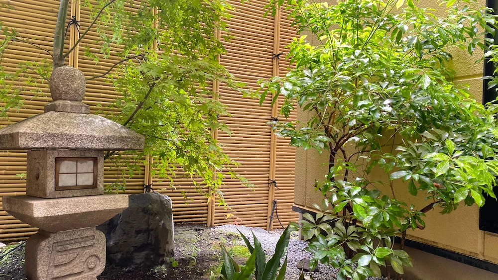
Japanese Modern Design Creates 'Tranquility'
Wa Modern is a design that incorporates traditional Japanese elements while combining contemporary layouts and ease of use. We believe its essence is to "create tranquility." The goal is not to line up Japanese elements, but to create an atmosphere where viewers can catch their breath. There are four main elements for this.
element | How it appears on the website |
Texture of the material | Photos that convey the texture of natural materials such as wood, washi, stone, bamboo, and soil, as well as background textures |
margin | Without cramming too much information, deliberately leaving empty spaces. Becoming the primary source of tranquility and quality |
color | It focuses on hazy colors found in nature, such as ink, natural green, deep green, indigo, and calm brown. |
Harmony | Colors, photos, text, and margins are all uniformly present on every page of the site. |
Add a small amount of Japanese symbols such as latticework, Japanese patterns, or Mincho fonts. However, using a lot of Japanese patterns or brush characters does not necessarily make it Japanese-modern. What matters is appropriately incorporating Japanese elements according to the appeal and target audience of your business.
First, what you want to decide: 'Refined Japanese' or 'Gentle Japanese'
The impression that comes to mind when you hear 'wa' varies from person to person. Broadly speaking, there are two main directions.
directionality | impression | coloring | A shop that matches well |
High-Quality Japanese Style | Quiet, deep, and dignified | Uses ink, indigo, deep green, and dark brown as the base, with plenty of margins | A long-established inn, traditional restaurant, workshop, and tea room |
Gentle Japanese | Soft, friendly, and warm | Layering pale colors such as cherry blossom color, young leaf color, natural color, and pale indigo | Japanese confectionery shops, cafes, experiential inns, services for women |
When unsure about colors, it's recommended to imagine Japanese flowers and seasonal scenery that closely match the brand's image. Is it softness like plum or cherry blossoms, or a dignified feeling like a bamboo grove in winter? From there, you can see the direction of the color.
The same applies to Japanese patterns. Rounded snow rings and cloisonné give a gentle and gentle impression. Straight scales and arrow kasuri add a sharp, elegant touch. However, only a small amount of them should be used. Even very thin patterns in the background or small decorations near the headline can fully convey the Japanese atmosphere.
Pay attention to the differences in how colors are seen.
Japanese colors often overlap with blurred hues, such as ink and natural dye, or indigo and deep green. They are beautiful, but combinations with small color differences can be hard to distinguish for some viewers.
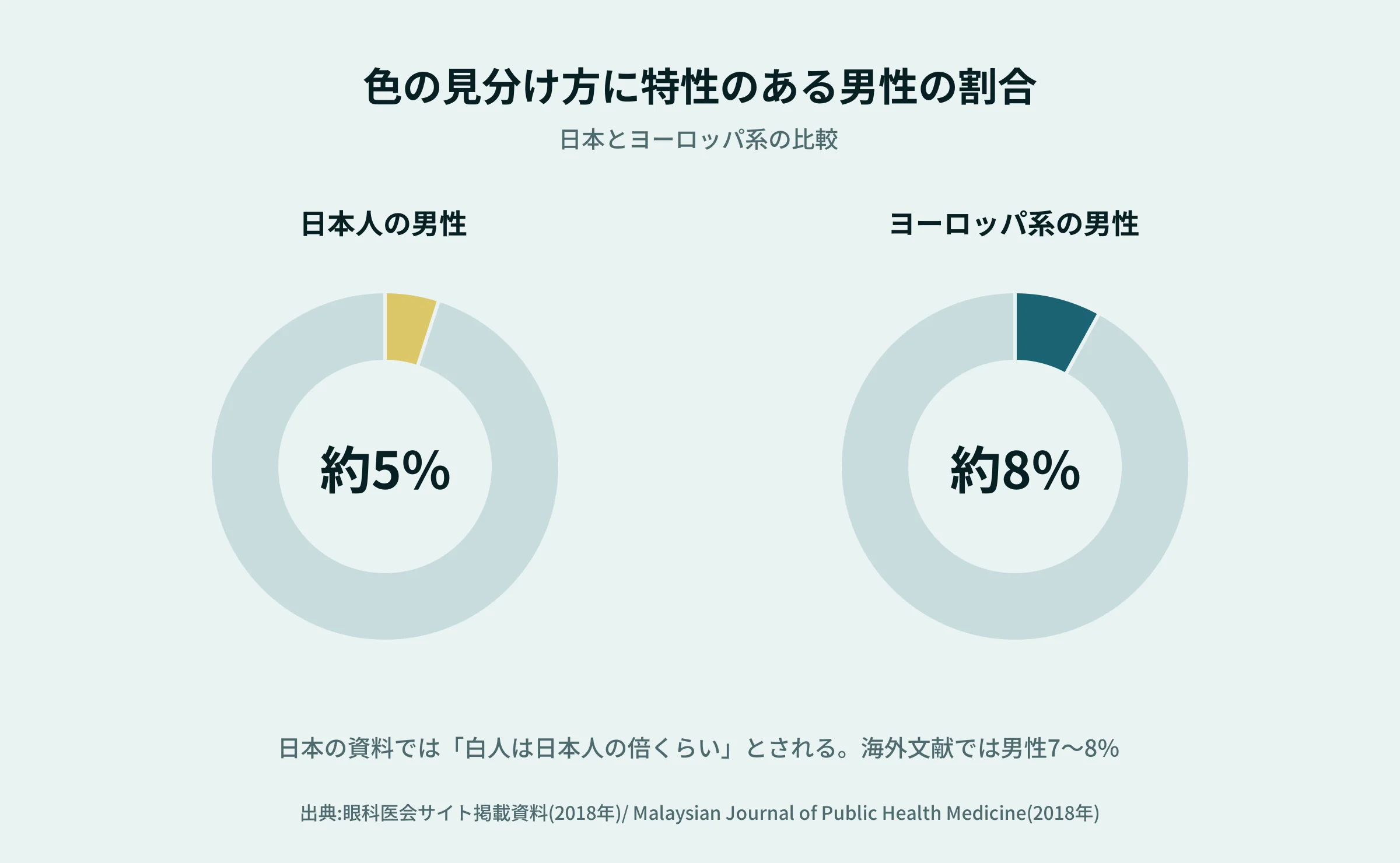
There are innate individual differences in how colors are distinguished. Among Japanese people, about 5% of men and about 0.2% of women. For White people, the frequency is said to be about twice as high. Overseas literature also reports that the proportion of men is about 7–8% of Europeans and about 4–5% of East Asian people. In other words, Europeans have a slightly higher proportion of distinguishing colors. If you are considering customers from overseas, this is an even more important point to consider.
- For text and background, make sure not only color differences but also brightness differences (do not place light gray text on a generated background).
- For example, "Red is a required item" or "Green has an empty seat," don't convey meaning by color alone. Include text and symbols
- Buttons and links should be distinguishable not only by color, but also by shape, underline, and text
You can achieve both the quiet color use of Japanese modern style and ease of viewing. Once you've decided on a color, it's easy to check by making it black and white.
References
- | Materials on color vision (April 2018)
- Malaysian Journal of Public Health Medicine | Prevalence of Congenital Color Vision Abnormalities (2018)
Unraveling Japanese modern designs piece by part
From here, let's talk about design itself. Space, text, photos, decoration. Each one may seem small, but when they overlap, it becomes the atmosphere of the entire site. I'll separate what we know from data and what we usually strive for.
Margins also help with readability.
Margins are not just for silence. In a 2004 experiment by researchers (Chaparro et al.) on the readability of text on the web, having margins around the text affected reading speed and comprehension, and participants tended to be more satisfied. On the other hand, the width between lines did not affect reading performance but did influence preference.
We use the following scale as a guideline (this is not a survey result but a production experience).
- Leave the headline wide open. "From here, a new story starts," so you can take a breath
- When writing, don't make each line too long. In Japanese, about 35–40 characters per line.
- The line spacing should be about 1.8 to 2 times the size of the text. Mincho font should be slightly wider than Gothic font.
- Don't overcrowd between photos and text. Leave space to "decorate" photos
Writing is less readable than you might think.
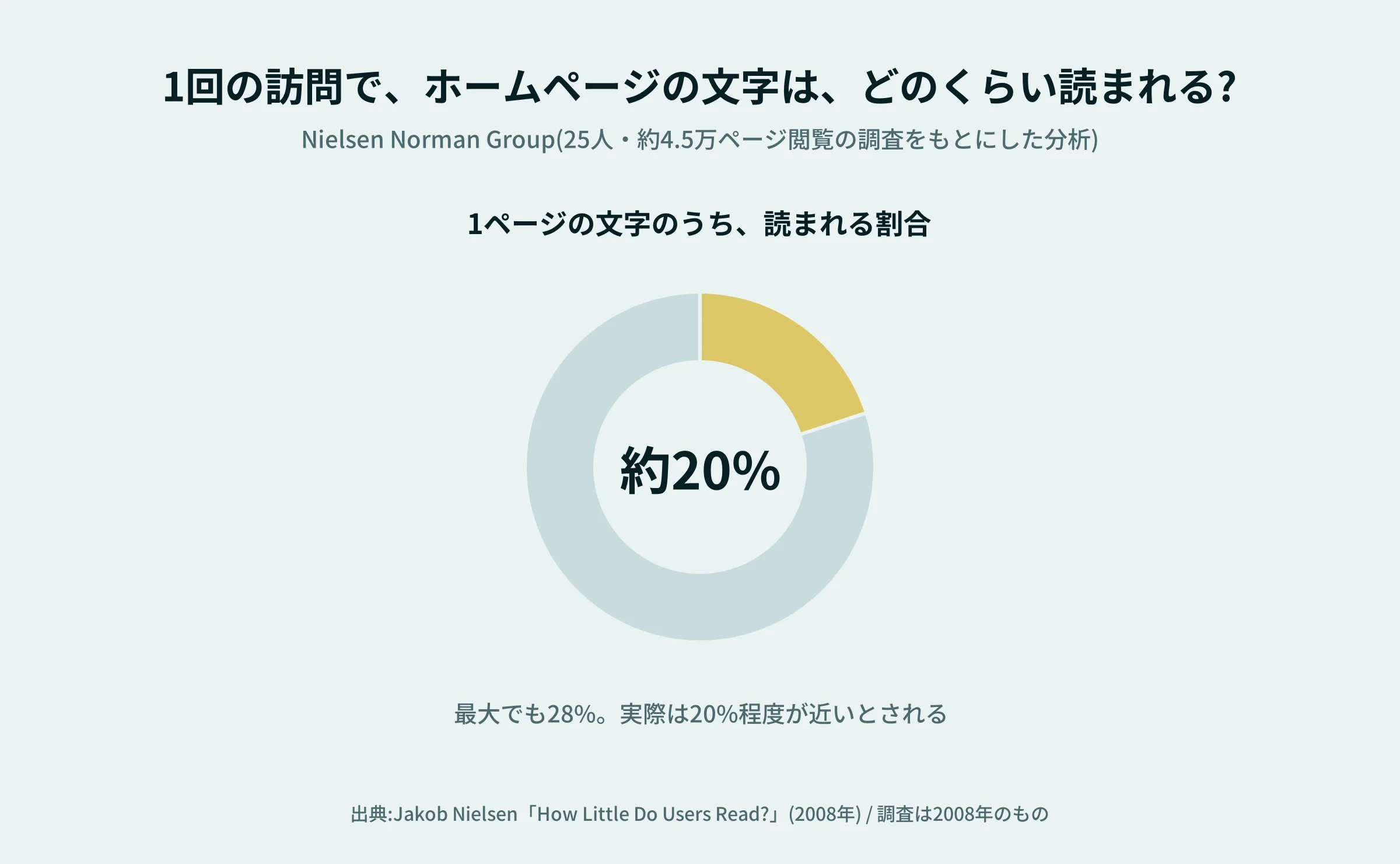
If you use a wide margin, you might worry about "not being able to include a lot of text." But actually, there's no need to worry that much. According to analysis by the Nielsen Norman Group, visitors read about 20% of the text on a page (at most 28%). For every 100 extra words on a page, the longer it stayed was only about 4.4 seconds.
This survey was from 2008, so the way people read it may have changed a bit now. However, I feel that the point that "people may not read all of a long text" hasn't changed. On Wa Modern sites, the heading, a brief explanation, and photos are used first. Detailed information is placed on the back page for those who want to read it. This kind of structure pairs well with the margins.
Regarding the characters, where to use the Mincho typeface,
When creating a Japanese atmosphere, the first thing that comes to mind is Mincho typeface. However, if you use Mincho font for all the text on your site, the small text may fade and the thin lines may become hard to see on smartphones. We use them differently as follows.
Location | Recommended Usage |
Headlines and Catchphrases | Mincho typeface. Create a world with large letters |
This text | Prioritizing readability. Gothic font or a thick Mincho typeface. A size that's not too small. |
Button Navigation | Characters that are clearly visible, such as Gothic fonts. So you can press without hesitation. |
Numbers, Dates, and Latin Characters | Choose a font that blends well with Japanese characters |
Even just using the headline in Mincho style really brings out a strong Japanese vibe. If you narrow down the text thickness to about three types, it becomes neat and organized.
Choose colors while adhering to the standards of "visibility"
Soft color combinations like ink and natural ink tend to be visually appealing but tend to make text harder to read. According to the international web guidelines (W3C's WCAG 2.1), the ratio of brightness (contrast ratio) between text text and background is 4.5:1 or higher, and for large text (18 points or 14 points or more), 3:1 or higher is the standard.
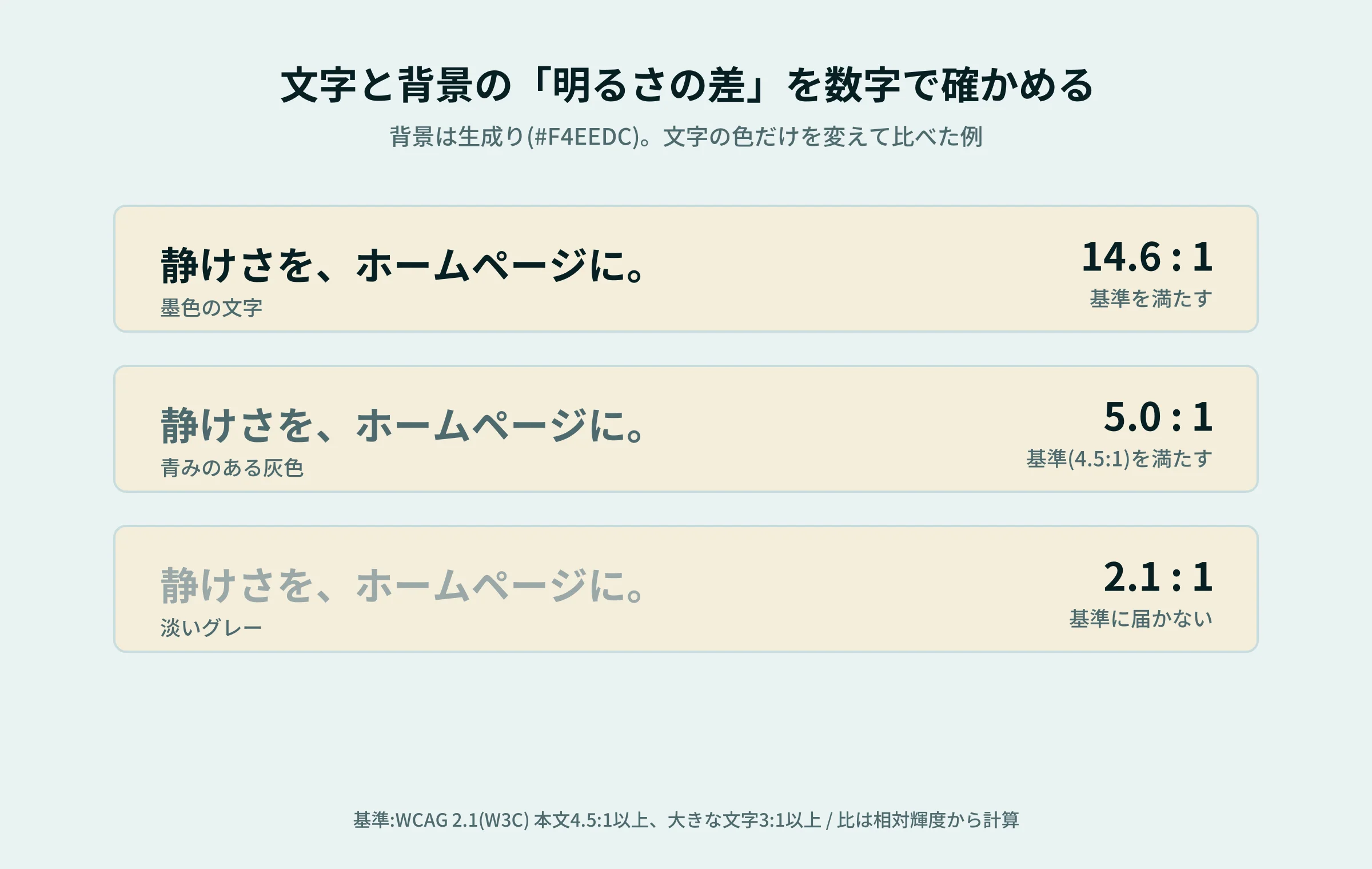
When deciding on Japanese modern colors, you select them by appearance and then check with these values. Even if the base is natural, the text should be slightly darker ink. Light colors should be used for background or decoration. This alone makes it easier to balance tranquility and readability.
Photos are the most effective for "authentic" products.
The photos create the very atmosphere of the Japanese modern site.
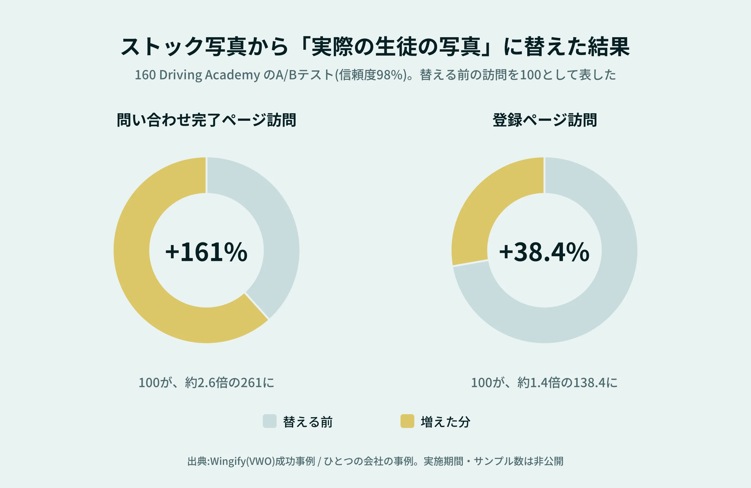
There is one interesting case. A company that provides driving lessons (160 Driving Academy) changed the photos on its homepage from common stock photos to photos of actual students, resulting in a 161% increase in visits to the inquiry completion page and a 38.4% increase in visits to the registration page (A/B test, reliability 98%). Since this is a case study of one company, the results may not be the same everywhere. However, this example suggests that "real photos are more likely to lead to trust."
When it comes to Japanese modern photography, we especially value the following three things.
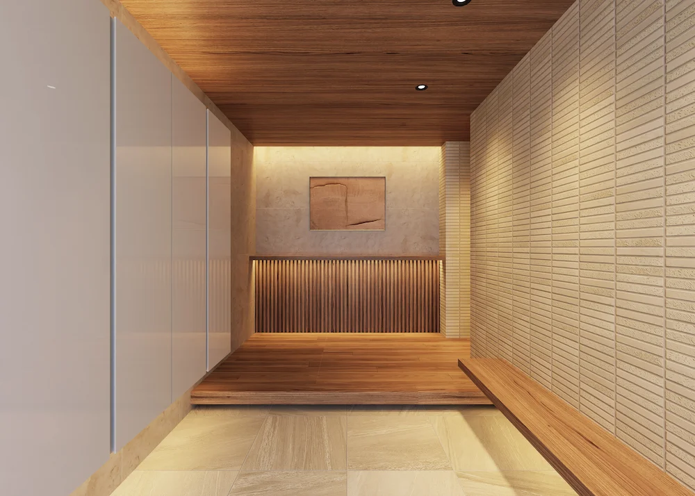
- Light: Soft shading from natural light enhances the texture of the material. Make good use of morning and evening light
- Hikiyori and Yokori: Combining 'Hiki' to show the entire space with 'Yori' to capture the vessel and wood grain
- Human Hands: When the hands of artisans or the hands carrying food are visible, the presence of "the person here" is conveyed
The color tone of the photos matches the site's colors. If only the photos look flashy, the quietness of the photos can be damaged.
Japanese patterns and accessories should be played as supporting roles
The key is not to overuse decorations like Japanese patterns, latticework, or ink smudges. We use them only a little in places like the following.
- Background: Very pale Japanese patterns, limited to only some sections
- Headline Area: Small lines or a single pattern as accents
- Sections: At the boundaries of sections, traces of ink or wave-like lines
- Movement: slow, softly appearing movements. Avoid fast or flashy movements
What you want to stand out is the store or the product itself. For the side, I think it's just right to have a 'supporting role' that quietly supports it.
References
- Chaparro et al.| Reading Online Text: A Comparison of Four White Space Layouts (2004)
- Nielsen Norman Group| How Little Do Users Read? (2008)
- W3C| WCAG 2.1 Minimal Contrast
- Wingify (VWO) | 160 Driving Academy Case Study
Changing the way Japanese modernity is created for both domestic and overseas markets.
Even with 'Japanese modern,' it's necessary to change the design structure between sites aimed at Japanese users and those aimed at overseas audiences. Sometimes, what is considered 'normal' for Japanese people may not be understood by people overseas.
Japanese people feel reassured by the "abundance of information"
It may be surprising, but Japanese corporate websites tend to contain more information than overseas ones. Fujitsu's blog (March 2025) points out that sites created by Japanese companies targeting domestic markets tend to be more packed with information than those aimed at overseas markets, and that "the more information available, the easier they are to be trusted." MultiLingual magazine (2018) also states that Japanese customers want detailed information before making decisions, so hiding information can actually lead to distrust.
In other words, Japanese modernity aimed at domestic customers values margin and tranquility, while placing "information you want to know" such as fees, rooms, access, and cancellation policies clearly visible. If you take too much margin and can't find information, a quiet design can become unsettling.
Overseas people start by communicating from the "context" first.
On the other hand, overseas customers often do not know the background or etiquette of Wa. From here, here is our assessment. For sites aimed at overseas markets, we believe it is more helpful to add "understandable clues" like the following rather than just adding information.
Design Points | For domestic use | For overseas markets |
amount of information | Show detailed information such as fees, policies, and access in a list | At first, narrow down the information and present the necessary information in order |
How to add words | Japanese words can be used as they are (such as 'Omotenashi' or 'Shun'). | Brief explanations are provided in Japanese words (for example, 'kaiseki' refers to a traditional Japanese course where seasonal dishes are served in order). |
How to Arrange Letters | Mincho font makes vertical writing stand out | Horizontal writing is the basic method. For Western text, choose a separate easy-to-read font |
Photos | Quietly making the space and material textures appear | Add photos that show "what you can experience" (such as showing people, showing the steps, etc.) |
Meaning of the color | Vermilion and gold give a festive and refined impression. | The way colors are received varies by country. Since red can sometimes appear as a warning, be careful with button colors and other details. |
Reservations & Purchases | Phone and Japanese reservation services are close at hand | Can be completed online. Currency, time difference, and cancellation conditions are easy to understand by reading |
Viewing Devices | We use different PCs and smartphones depending on our age group. | Smartphones tend to take center stage. Avoid small print |
For example, for ryokan, for domestic customers, you can carefully provide information about "rooms, food, and baths," while for overseas customers, you can easily understand "how to spend time from arrival to check-out" at a glance. If you want to change things this much, simply adding an English page to a single site may not be enough. It is recommended to separate the page structure for domestic and international users.
Can the tranquility of 'Japanese modern' be brought in as is?
This is also our assumption, but I feel that the very concept of Japanese modernity—such as tranquility, empty space, and material quality—is easily accepted across countries. What needs to change is not the worldview, but the "order in which we communicate" and "understandable clues."
The worldview remains intact, providing information that Japanese people can feel secure about, while subtly adding context to overseas audiences. This distinction is the biggest difference between domestic and overseas audiences.
References
- Fujitsu| When clutter got purpose (March 2025)
- MultiLingual| The truth about Japanese web design (2018)
Why is it important to have a website that conveys the charm of Japanese cuisine right now?
Inbound visitors to Japan reach the largest scale ever.
According to the Japan Tourism Agency's "Inbound Consumption Trend Survey" 2025 Annual Report, the number of foreign visitors to Japan in 2025 is expected to reach 42,683,837, a 15.8% increase from the previous year. Travel spending by inbound foreign visitors is 9.4549 trillion yen. Travel spending per general visitor is 229,000 yen.
As more people visit Japan, more people will turn their attention to shops and workshops that have a distinctly Japanese character, such as inns, restaurants, Japanese sweets, and crafts. At that time, the first thing you see is often the website.
References
Japan Tourism Agency | Inbound Consumption Trend Survey 2025 Annual Report (PDF)
What travelers want is an "authentic local experience."
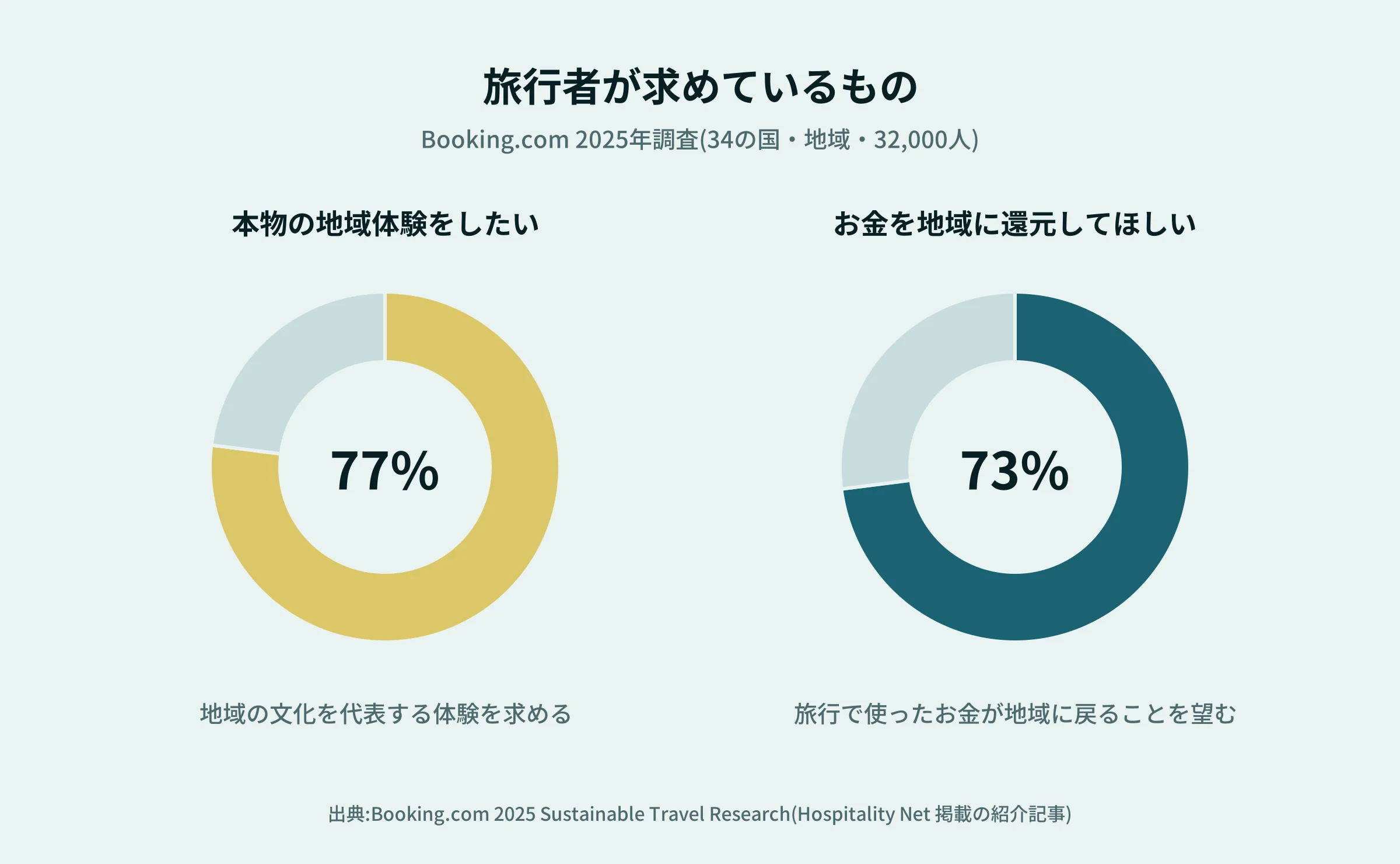
In a 2025 survey conducted by Booking.com of 32,000 people across 34 countries and regions, 77% said they wanted authentic experiences that represent local culture, and 73% wanted the money spent on travel to be returned to the community.
The more people seek the "authentic," the more important it is to properly convey the history of the shop or workshop, the materials, and the creator's intentions through words and photos. Japanese modern design is about creating the atmosphere at the entrance.
References
Hospitality Net|Booking.com Introduction to the 2025 survey
As the number of people carrying on tradition decreases, the power to communicate becomes necessary.
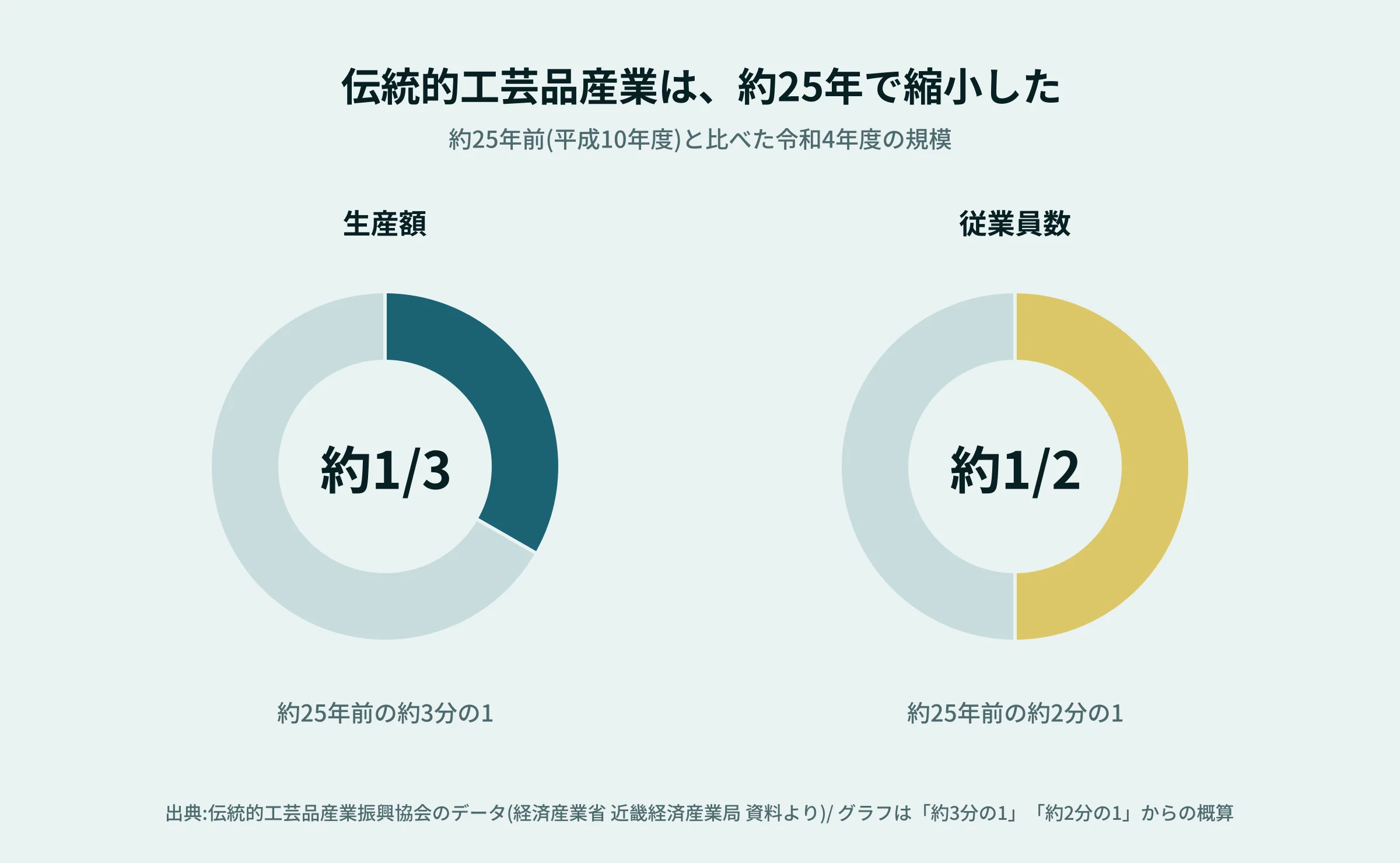
On the other hand, traditional industries are also facing tough conditions. According to data from the Bureau of Economy, Trade and Industry, the production value of traditional crafts has decreased to about one-third of what it was about 25 years ago, and the number of employees has dropped to about half (as of fiscal year 2022). Even for 74 traditional craft items in Kyoto City, the shipment value and number of employees are about half of those from about 15 years ago.
Even if you create something good, if its value is not recognized, it becomes difficult to continue. A website is one of the most accessible means to deliver value to people far away and to the next generation.
References
Bureau of Economy, Trade and Industry | frontline No.30 (PDF) (Data from the Traditional Craft Industry Promotion Association and Kyoto City Traditional Industry Revitalization Promotion Council)
Design can influence 'trust' in a very short time.
First impression: Can it be decided in 50 milliseconds?
In a study by Lindergaard and colleagues at Carleton University in Canada (in Behaviour and Information Technology), when web pages pre-rated as visually pleasing or uncomfortable were shown for just 50 milliseconds, participants' ratings of visual appeal matched well with their ratings for longer viewing sessions. Researchers point out that if the first impression is not favorable, visitors leave the site before noticing the difference from other companies.
50 milliseconds is shorter than blinking. Before reading the content, you already decide whether "I like this site" or "It might feel different."
The calm and modern Japanese atmosphere instantly conveys the store's worldview.
References
Nature| Web users judge sites in 50 milliseconds
About 46% of the reasons for judging reliability are 'appearance'
Stanford University's Web Credibility Project analyzed 2,440 comments. Of the reasons for judging a site's reliability, 46.1% mentioned "design and appearance." People may be sensing whether a site is trustworthy by appearance before the content.
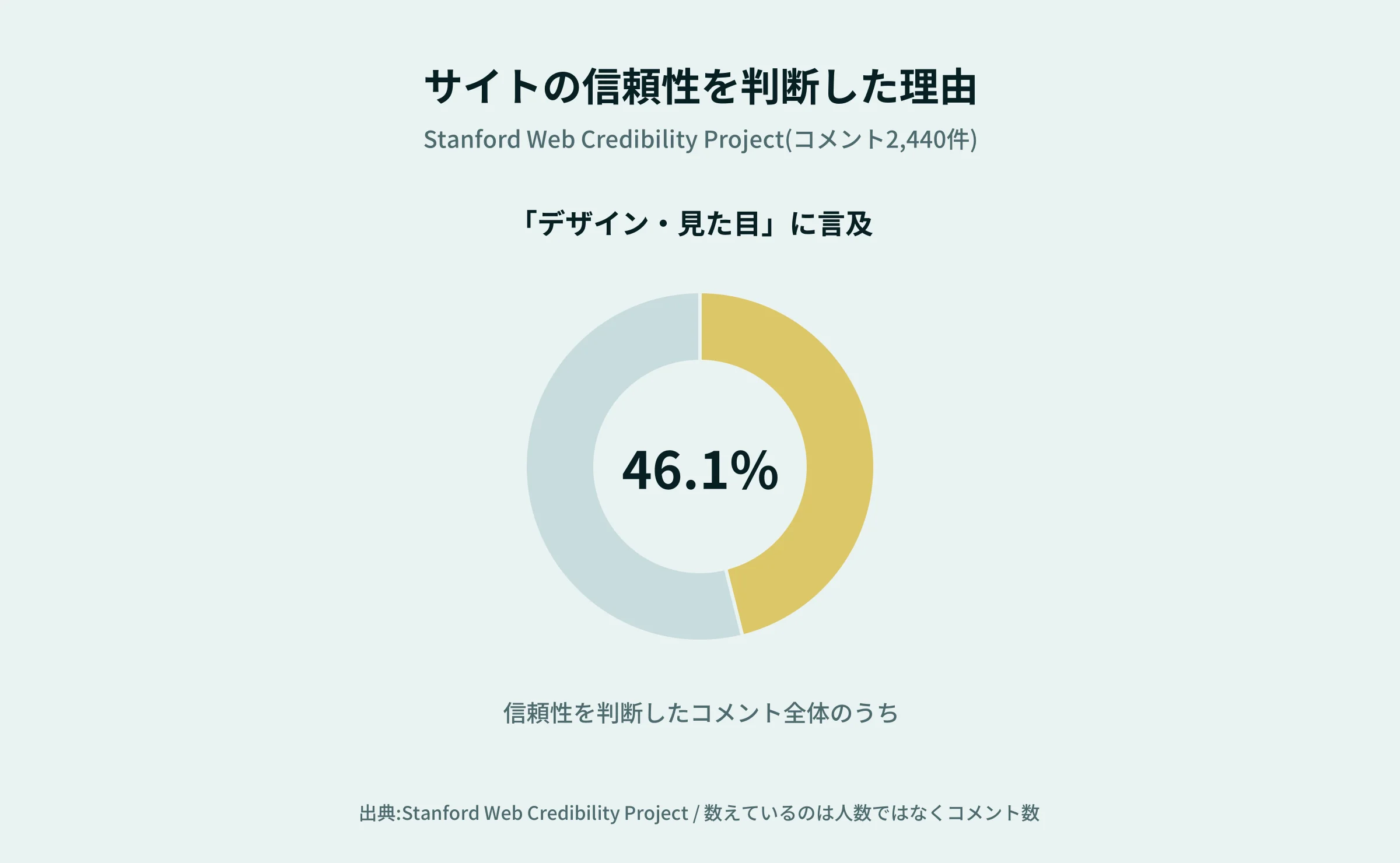
This survey counted comments rather than the number of people, and it dates back over 20 years. Even so, this is well-known data that supports the idea that 'appearance leads to trust.' The appearance that makes people feel like a proper shop is the more important the long-established inn or artisan's workshop is, the more important the foundation it is.
References
Stanford Web Credibility Project| How Do People Evaluate a Web Site's Credibility?
Industries suited for Japanese-modern websites
Wa Modern can be used in a variety of industries.
- Inns and Hotels
Conveying calmness, a sense of the extraordinary atmosphere, and hospitality - Restaurants & Japanese Restaurants:
Conveying the beauty of the food and the atmosphere inside the restaurant - Japanese confectionery shops and food brands
Communicating the ingredients, manufacturing methods, and value as gifts - Traditional Crafts & Workshops
Conveying the craftsmanship's skills and passion for craftsmanship - Architecture & Construction Companies
Conveying the beauty of wood, natural materials, and spaces - Beauty and Wellness Facilities
Creating a sense of tranquility and quality time
Even within Japanese modernity, the key points vary depending on the industry, such as ease of reservation at ryokan and the appeal of products and the purchase process at craft shops.
Estimated costs for creating a Japanese-modern website
Production costs vary depending on the number of pages, the scope of original design, photography and update mechanisms, reservation and e-commerce functions, and more. It's not determined by "expensive or cheap because it's Japanese-modern," but the price changes depending on how far you make it.
Cost Images by Scale
For example, our production fees are as follows. There may be a range depending on the production company, but please use them as a guide when considering your budget.
scale | Fees (tax included) | Content Image |
Homepage + Announcements & Blog Focus | From 440,000 yen | Clearly conveys the world and basic information on a single page. Suitable for workshops and small shops |
Top page + about 9 pages below | From 880,000 yen | Introducing menus, rooms, special features, access, and more. Suitable for inns, restaurants, and Japanese confectionery shops |
Equipped with EC, multilingual, and media functions | Individual estimates | Sites for online shopping, overseas distribution, and nurturing reading materials, etc. |
In addition, domain and server fees can start from several thousand yen per year. Post-launch maintenance and operational support is generally added monthly as needed.
Key Points That Affect Costs
- Scope of original design production
- Number of pages to be published and the amount of manuscripts to be published
- Professional photography and video shooting
- Animation and other production
- How the update works (WordPress, microCMS, etc.)
- Introduction of systems for reservations, payments, and e-commerce
Especially on Japanese-modern sites, the quality and presentation of photos affect the overall impression. It's important to consider your budget not only for design costs but also for photography and manuscript creation.
Estimated Production Period and Flow
The standard production period is about three months. If there are complex systems like e-commerce, it may take even longer. The following 10 steps are an example.
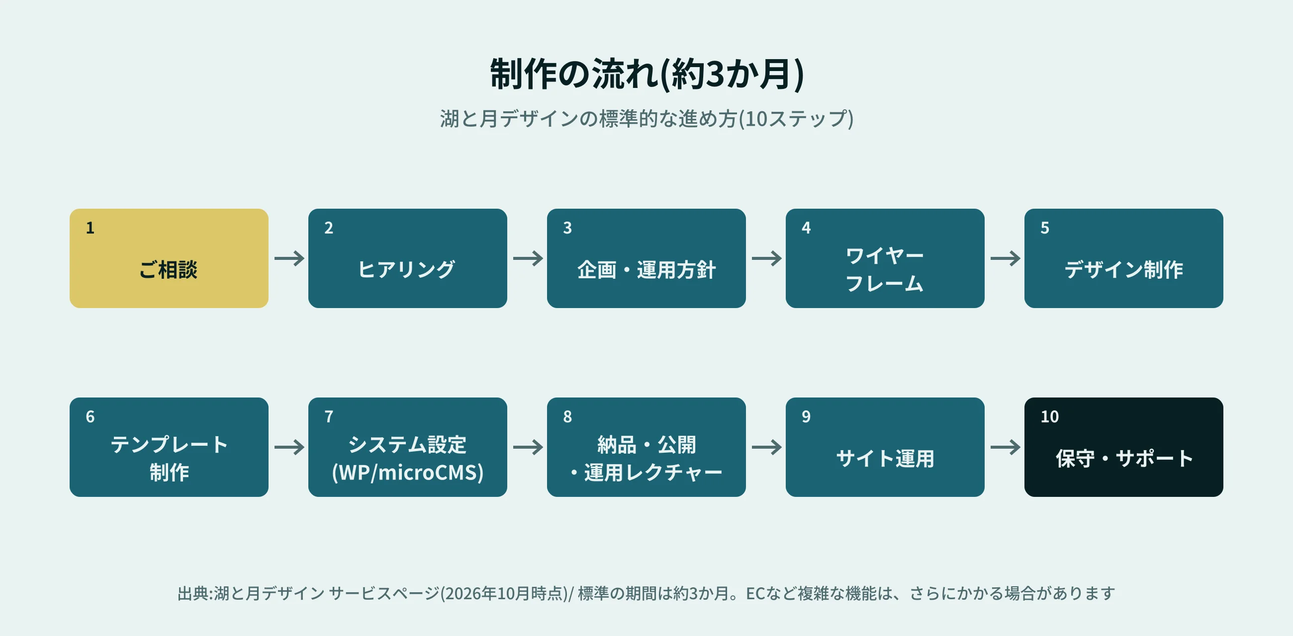
A Japanese-modern site is the real deal after it's published. The more you update and update seasonal photos and announcements, the more attractive it becomes. It's reassuring to decide from the start, including how to operate the site.
Five Key Points to Avoid Failure in Japanese-Modern Website Creation
(1) Don't overload Japanese elements
Using a lot of Japanese patterns, brush lettering, red, or gold can sometimes give a different impression than the quality you were aiming for. Narrow down the elements necessary for the brand and express the worldview through blank space and color usage.
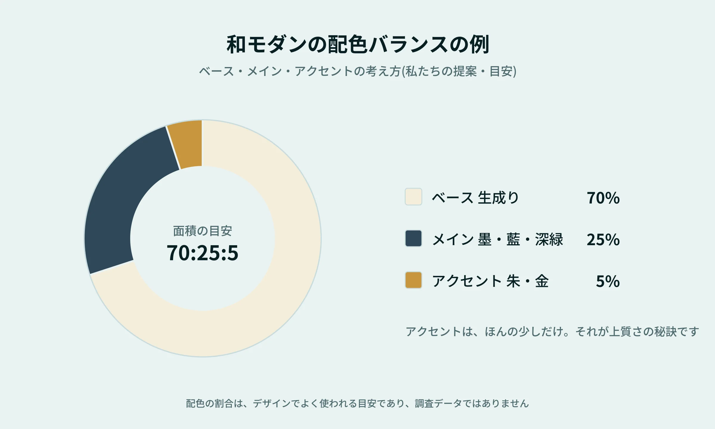
As a guideline, consider the color balance as about 70% base production, 25% main ink, indigo, and dark green about 25%, and accents like vermilion and gold about 5%, making it easier to unify (these are commonly used in design rather than survey data).
(2) Focus on photo quality
Photos—buildings, cuisine, products, artisans' craftsmanship—are important elements that convey a brand's appeal. Align the design and photography direction to create a unified feel throughout the site.
(3) Clearly Tell Who and What to Communicate
Do you prioritize luxury or friendliness? Whether you aim for 'high-quality Japanese' or 'gentle Japanese,' the design changes significantly depending on your goal. After organizing your target audience and the purpose of your site, you move on to production.
(4) Don't forget how easy it is to see on your smartphone
According to the Ministry of Internal Affairs and Communications' "2024 Communication Usage Trend Survey," 90.5% of households owned smartphones. Individuals also own smartphones at over 80%. This means that most people browse websites on their smartphones.
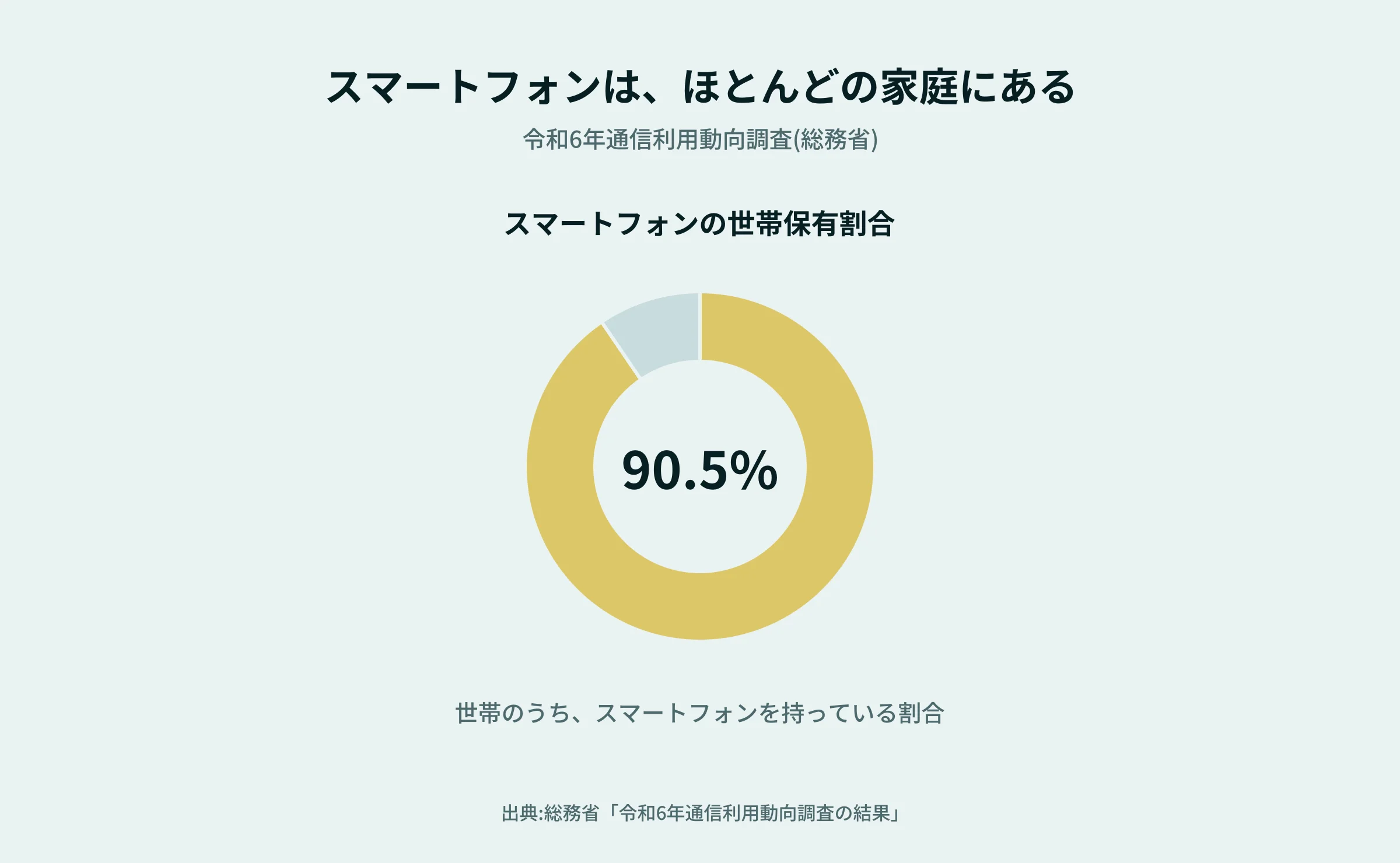
Even with a beautiful layout, if the text is small or hard to use on a smartphone, it cannot be called an easy-to-use site. You can check margins, font size, menus, and contact buttons on your actual smartphone.
References
(5) Design pathways to inquiries, reservations, and purchases
Make sure that obsessing over design doesn't make reservations or inquiries hard to understand. Arrange the necessary information and paths that lead to your next action appropriately according to the site's purpose.
Things to check when choosing a production company
When requesting a Japanese modern website, it's important to check not only the price but also the following points.
- Can it accommodate Japanese atmosphere and brand expression?
- Do they understand the industry and business objectives?
- Can you also consult about photo and manuscript creation?
- Whether it is designed to be smartphone-friendly and to be found by searches,
- Can you consult about updates and maintenance after publication?
- Whether the scope of work included in the estimate is clearly defined.
It's important to choose a production company that not only excels at Japanese modernity but also considers the purpose of the business together.
Kototsuki Design Creates a Japanese-Modern Website
A Japanese-modern website is not complete simply by expressing a Japanese atmosphere. What the store or brand values most, the appeal of its products or services, and what visitors want to feel. I believe it is important to organize these from the conversation and translate them into design and information design.
Aesthetic appeal, clarity of information, and ease of use. We aim to create a website that truly conveys the appeal of our business, valuing both. We also accept consultations including photography.
Frequently Asked Questions
What kind of design does a Japanese-modern website look like?
The design combines traditional Japanese elements with modern layouts and ease of use. It is characterized by a sense of material, simple beauty, reinterpretation of traditional elements, and harmony and balance. The goal is not to use many Japanese patterns or brush characters, but to express tranquility and quality through blank spaces and color choices.
How much does it cost to create a Japanese-modern website?
In our case, the top page + announcements and blogs cost from 440,000 yen, and the top page + about 9 pages below costs from 880,000 yen (tax included). Sites with features like e-commerce or multilingual support are quoted individually. Costs vary depending on the number of pages, photo shooting, updating mechanisms, and whether the system is available.
How long does production take?
The standard time is about three months. If you need to include complex systems like e-commerce, it may take even longer. From consultation, to design, design, production, publication, and operational training, we proceed in 10 steps.
Should I have a professional take the photos?
On Japanese-modern websites, the quality and presentation of photos greatly affect the overall impression. Buildings, cuisine, products, and artisans' craftsmanship are especially effective where professional photography is most effective.Kototsuki Design We also accept consultations including photography.
Can you please update or maintain it after publication?
Yes. Monthly maintenance and operational support are available as optional options. Operational lectures are also included in the production process.
Should I use Japanese patterns or brush characters?
It's not essential. Using lots of Japanese patterns or brush lettering doesn't necessarily make it Japanese-modern, so it's best to incorporate them modestly according to your brand's personality and target audience. When using them, prioritize maintaining readability.
A website that conveys the charm of Japanese modernity
Wa Modernity is an expression that combines traditional Japanese culture with contemporary usability. The number of visitors to Japan reached a record high of 42.68 million, and 77% of travelers seek an "authentic local experience." And the first impression of a site is determined in a very short time.
We want a website that values the charm of Japanese while ensuring its value reaches those who truly need it. We welcome inquiries from businesses that value the Japanese atmosphere, such as inns, restaurants, Japanese confectionery shops, and workshops.
 Contact Form


 Related Articles