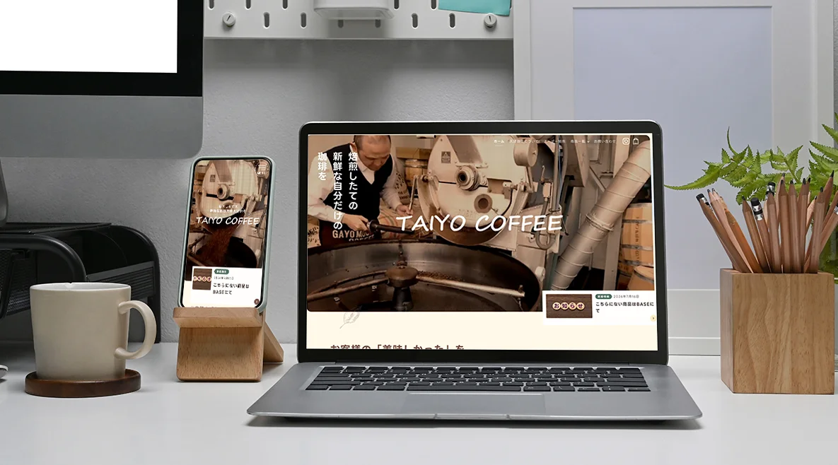
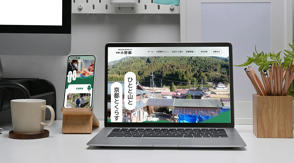
.webp)

Hello. This is Lake and Moon Design.
When you think, “I want to create a great website,” what kind of site comes to mind first?
Beautiful photos filling the screen, with text appearing smoothly and stylishly. That is certainly a “beautiful website.”
However, from a professional development perspective, we have to say that the equation “beautiful design = good website” is actually a rather dangerous misconception.
In fact, there are countless websites out there that look beautiful and polished but fail to deliver any results—they don’t generate inquiries or attract readers.
In this article, I’ll discuss the “true criteria for evaluating design” in websites, incorporating our unique perspective at Lake and Moon Design—one that goes beyond mere visual appeal.
Design Is Not the “Goal,” but “One Means to an End”
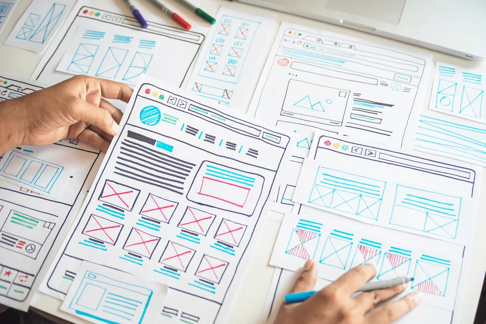
Design is not art.
If art is “something to be shown” for the sake of self-expression, then design is a means “to convey information and emotion.”
It is an approach designed to prompt users to take action (such as making a purchase, submitting an inquiry, or raising awareness), and design is created only when there is a specific objective to achieve.
In other words, the essence of design is not decoration, but rather a plan for achieving a specific goal.
The Common Misconception That “Pretty = Good Design”
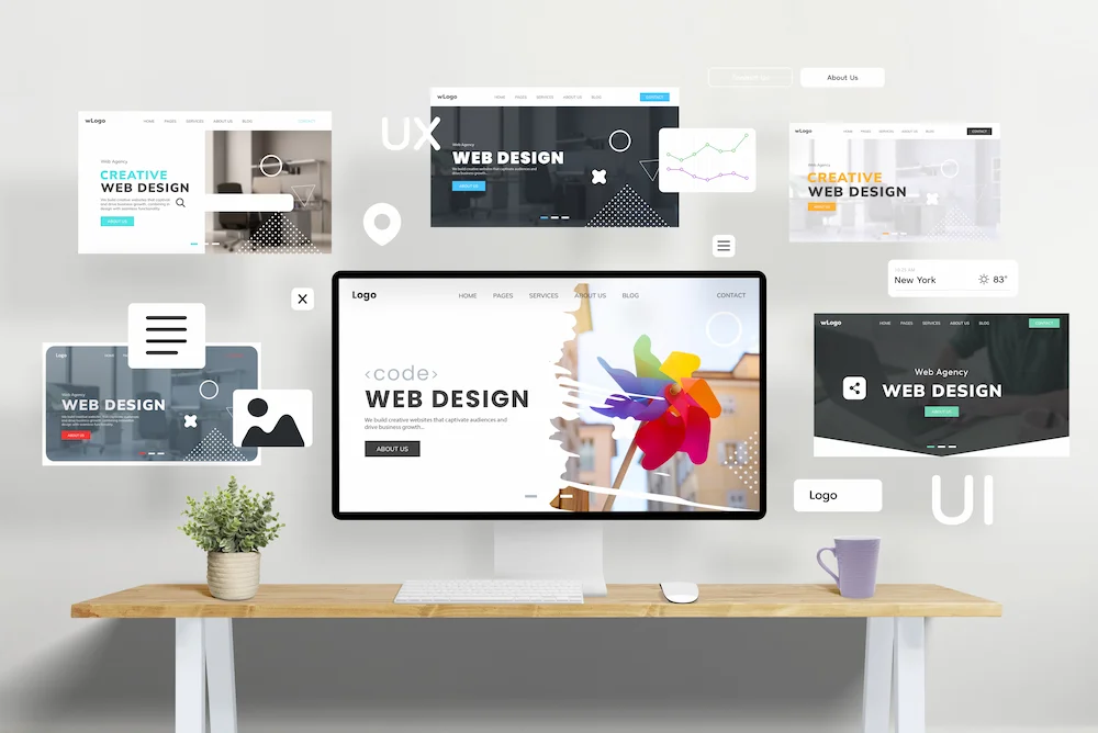
In the world of web design, I feel there is a somewhat prevalent misconception like the one described below. Simply making something look good will not lead to business results.
Common Misconception (Focus on Appearance) | Why Is This Dangerous? (The Truth from the Production Front Lines) |
“If you incorporate trends, you’re doing it right” | Even unconventional layouts or trendy designs become nothing more than noise if they don’t fit within your company’s “brand context.” |
Elaborate UI (Motion and Usability) | Excessive animation and complex interactions often get in the way of users who are purposefully searching for information. |
Simple or Cluttered? | If it’s too simple, it won’t convey your appeal; conversely, if it’s too cluttered, users will get lost. It’s important to include the “right amount of information” based on your purpose. |
To avoid any misunderstanding, let me clarify: having beautiful photos is, in and of itself, generally a wonderful thing. However, it’s dangerous to judge a website solely on the basis that “it’s a good site because the photos are beautiful.”
So, what is essential design? Let’s break it down from three perspectives.
Essence #1: “Design as Information Architecture”
The first step in design isn’t deciding on colors or layouts—it begins with “organizing the priority of information.” Users aren’t visiting to admire the design; they come with a specific “purpose,” such as solving a problem.
The Perspective of Information Architecture | Specific Checkpoints in Design |
Organizing Priorities | While maintaining the core of your company’s philosophy and concept, is the information arranged in the order that users “want to know”? |
User-First | Does the design directly address the visitor’s purpose (such as solving a problem or gathering information)? |
Rather than simply listing information, carefully arrange the content where “our identity” and “what users are looking for” overlap. This is what constitutes professional information architecture design.
Essence #2: “Information Curation (What Constitutes the Right Amount of Information?)”
“Stripping information down” isn’t the only right approach. That said, “cramming in information” isn’t the answer either.
It’s not enough for something to simply be “simple,” nor is it good if it’s cluttered. What’s important is determining the appropriate amount of information needed to achieve the specific goal.
For example, there are designs that convey emotion using “white space” and “fonts,” as I mentioned earlier, while others—like supermarket flyers—intentionally arrange information to convey a sense of vibrancy.
In either case, rather than blindly adding or removing elements, the key is to “carefully select and present the appropriate amount of information” based on the criterion of “what is optimal right now” for the given purpose. This is where a designer’s skill truly shines.
Quality #3: Consistency of Intent
What do you ultimately want users to do on that website?
The “intent”—where you want to guide users—must be consistent throughout the site while maintaining the company’s unique identity. This is the condition for a design that works.
The Decisive Difference Between Bad and Good Design
Let’s now compare the decisive differences between the two—specifically, what makes one good and the other bad.
Points of Comparison | “Bad Design” That Fails to Deliver Results | “Good Design” That Achieves Its Purpose |
Rules and Consistency | UI and design rules are inconsistent | Users don’t get confused about where to look next |
Eye Movement | The flow of the gaze is disjointed and tiring | Information flows naturally into the mind |
Contrast and balance | All elements are presented with the same intensity | Reading is stress-free |
Final state | Ultimately, it’s unclear “what the site is trying to convey” | You find yourself understanding it without even realizing it |
Truly good design is “unobtrusive design” that doesn’t draw attention to the design itself.
A good website is one with “a design that doesn’t get in the way and conveys the site’s unique character.”
A good website isn’t simply one with a beautiful design.
The fundamental premise is that it must be “a user-friendly design that doesn’t hinder the user’s understanding.”
But that’s not all. Our vision of the ideal website is one that “accurately delivers the information users want and conveys the company’s image (its unique character) through design.”
Ultimately, the evaluation comes down to whether that design is “driven by a consistent vision.”
Summary | Design Is Not About “Finding the Right Answer” but “Optimizing for the Purpose”
Design has a deeper dimension that cannot be measured solely by visual appeal.
It’s not about “searching for a single correct answer,” but rather “optimizing for your specific goals” tailored to your business. There’s no need to over-embellish; conveying the strengths and appeal of your business is the top priority.
 Contact Form


 Related Articles