
Hello. This is Lake and Moon Design.
When considering creating or redesigning a website, people tend to pay close attention to photos and color schemes, but surprisingly, they often end up choosing fonts “on a whim.”
However, in design, text is not merely a symbol. It is “one of the impressions” that a brand conveys.
In this post, I’ll discuss “impression design” in font selection—a concept that goes beyond mere visual appeal.
Fonts are “one aspect of a website’s impression”
Just imagine this:
Imagine a front desk clerk at a luxury hotel standing there in a crisp suit, but the text on the welcome card is scrawled in marker… It completely ruins the elegant atmosphere, doesn’t it?
Choosing the wrong font is exactly the same situation.
Imagine a brand that wants to quietly convey trust, but the letterforms are too round and childish. Conversely, imagine a service that prides itself on approachability, but the sharp corners of the letters make it feel cold. Only when the “message you want to convey” and the “expression of the type” align will your brand’s message be properly received by your audience.
How to Choose a Font: Who Is the Audience, and How Will It Be Presented?
Font Types and the “Atmosphere” They Convey
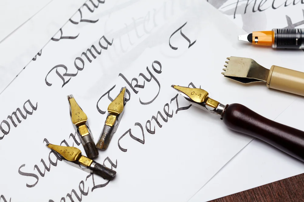
Each font has its own “role” and “personality.” Simply understanding these five main categories will make it much easier to control the impression your website makes.
- Mincho
Trust, tradition, sincerity. A refined impression, as if speaking politely with good posture.
- Sans-Serif
Modern, approachable, and rational. A bright, crisp, and down-to-earth strength. - Rounded Gothic:
Gentleness, reassurance, and a youthful feel. A soft, rounded appearance that feels warm and enveloping. - Calligraphic:
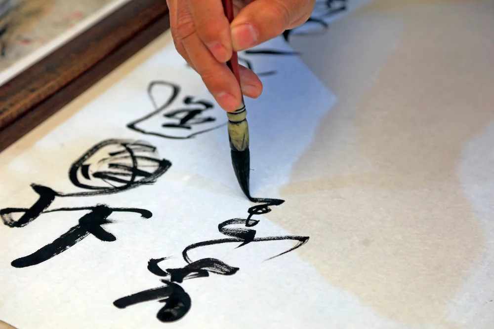
Passion, Japanese tradition, and artisan spirit. A powerful, energetic brushstroke. - Design Fonts: A unique
worldview and artistic flair. Distinctive expressions that instantly convey a sense of “authenticity.”
Quick Reference Chart for Font-Specific Impression Design
Font Type | Main Impression | Suitable Websites |
Mincho | Trust, Tradition, Sophistication, Sentiment | Law and medicine, long-established brands, luxury ryokan, beauty |
Sans-serif | Modern, Approachable, Clear, Powerful | IT and Web Services, Recruitment Sites, General Businesses, News |
Rounded Gothic | Gentleness, reassurance, approachability, cuteness | Education, Childcare & Nursing Care, Handmade Goods, Food |
Calligraphic | Japanese tradition, strength, craftsmanship, warmth | Restaurants (Japanese cuisine, ramen), traditional crafts, sake |
Design-related | Unique, Artistic, Pop, Distinctive Aesthetic | Campaign landing pages, apparel, logo design |
Designs that embody “kindness” by connecting with the target audience
Design is not about self-indulgence; it begins with “consideration” for the person on the other side of the screen.
For the 50+ demographic, choosing a font that’s too thin “just because it’s
stylish” is actually quite inconsiderate. Maintain a consistent thickness to ensure the text “catches the eye effortlessly and naturally.”
For
younger audiences, while readability is a given, it’s also effective to prioritize fonts with slightly edgy forms or a unique atmosphere.
Baumkuchen and Itokiri Mochi: Their Respective “Expressions”
Let’s consider the impression fonts create using my favorite traditional sweets as examples.
- The Impression of Itokiri Mochi Itokiri mochi, with its beautiful three-colored stripes, has long been beloved in front of the gate of
Taga Grand Shrine. A Mincho typeface that evokes a dignified, brush-like stroke suits this confection well. It’s a “quiet typeface that makes you sit up straight,” conveying a sense of history, tradition, and refined sincerity. - The Impression
of Club Harie’s Baumkuchen It evokes the craftsmanship of the artisan while feeling somehow modern and elegant. A bright, crisp, and warm Gothic typeface fits this perfectly. It’s a “friendly, lively typeface” that creates that sense of excitement the moment you open the box.
What if these two fonts were swapped? We would surely sense something off—a subtle “something’s not quite right”—before we even had a chance to imagine the taste.
Specific Example: Web-Friendly Fonts and “Impression”
Fonts are chosen based on “what kind of expression you want to convey” rather than “which one to use.” Using Google Fonts—commonly used in web design—as an example, let’s look at three representative impressions.
Font Name | Characteristics/Impression | Recommended Use Cases |
A standard typeface with a neutral, trustworthy feel. It’s not overly assertive and offers excellent readability. | Corporate websites, career pages, and other contexts where “clear, unambiguous communication” is essential. | |
A soft, approachable, and gentle typeface. The slightly rounded corners give it a less rigid appearance. | Ideal for small business websites, local services, and other contexts where conveying a “sense of security” is key. | |
A typeface with ample white space that exudes tranquility and elegance. It combines the refined elegance characteristic of Mincho typefaces with a modern, airy feel. | Ideal for branding sites and high-end services—designs where “atmosphere” is a key value. |
The “thickness” that defines a brand’s personality
Simply making text bolder “to make it stand out” isn’t design—it can often become nothing more than “emphasis.”
- Bold fonts: Tradition, solidity, a sense of security. A “powerful stroke” that feels firmly rooted in the earth.
- Thin fonts: Clean, modern, delicate, sophisticated. A “crystal-clear stroke” that conveys intelligence.
How do you want your company to be perceived? The essence of impression design lies in working backward from that vision to select the font weight down to the 1px level.
Size and Jump Ratio: Creating the “Rhythm” of Information
The difference in font size (size variation) represents the “emphasis” of the information.
Text where everything is the same size appears as a monotonous list, making it unclear what is important.
Capture the reader’s attention with large headings, then convey information with an appropriate body text size. This is not only a technical skill but also the design of a “rhythm of hospitality” for users—one that creates a pleasant reading experience.
Summary: Type is “a language for designing impressions”
A font does not determine an impression on its own; it is only when combined with white space, line spacing, and the tone of photographs that it forms a cohesive impression.
Once you’ve met the minimum requirement of “readability,” seek out the “ideal expression” that lies beyond it.
Fonts are not merely decoration; they are the very essence of design that determines “how you want to be perceived.” If you proceed with design while leaving this point ambiguous, no matter how beautiful it is, your website will fail to get your message across.
Is your website currently conveying your message with the ideal image?
 Contact Form


 Related Articles